当前位置:网站首页>微信小程序入门教程学习笔记——UI篇之布局基础
微信小程序入门教程学习笔记——UI篇之布局基础
2022-07-22 10:51:00 【萌萌怪】
目录
一.布局基础
flex布局 ( display:flex )
1.flex的容器元素

2.flex容器属性
| 属性名称 | 作用 | 取值 |
| flex-direction | 决定元素的排列方向 | colum、row(默认) |
| flex-wrap | 决定元素如何换行(排列不下时候) | warp、nowarp(默认)、warp-reverse |
| flex-flow | flex-direction和flex-wrap的简写 | 略 |
| justify-content | 元素在主轴上的对齐方式 | center、flex-start、flex-end、space-around、space-between ...... |
| align-items | 元素在交叉轴上的对齐方式 | flex-start(默认)、flex-end、center、stretch、baseline ...... |
TIPS:
flex-direction 决定了主轴和交叉轴,colum→从上到下是主轴;row→从左到右是主轴
flex-flow 是简写,属性值中间用空格连接
效果图:
2.1 flex-direction
display: flex;
flex-direction: row;
display: flex;
flex-direction: column;
2.2 flex-wrap
display: flex;
flex-wrap: wrap;
display: flex;
flex-wrap: nowrap;

display: flex;
flex-wrap: wrap-reverse;
2.3 justify-content
display: flex;
justify-content: center;
display: flex;
justify-content: flex-end;
display: flex;
justify-content: flex-start;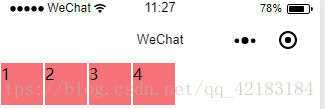
display: flex;
justify-content: space-around;
display: flex;
justify-content: space-between;
2.4 align-items
display: flex;
  justify-content: space-between;
  align-items: flex-start;
display: flex;
  justify-content: space-between;
  align-items: flex-end;
//以第一行文字对齐,给第三个小方块加了特效
display: flex;
justify-content: space-between;
align-items: baseline;
此时再将align-items设为flex-start,可以清晰的观察出其本质区别

3.flex元素属性
| 属性名称 | 作用 | 取值 |
| flex-grow | 当有多余空间时,元素的放大比例 | 0(默认)...其余数值(放大倍数) |
| flex-shrink | 当空间不足时,元素的缩小比例 | 1(默认)...其余数值(缩小倍数) |
| flex-basis | 元素在主轴上占据的空间 | 数值,单位px |
| flex | grow、shrink、basis的简写 | 略 |
| order | 定义元素的排列顺序 | 1 2 3 4...顺序数值 |
| align-self | 定于元素自身的对齐方式 | flex-start、flex-end、center |
3.1 flex-grow
flex-grow: 1;

.item{
  flex-grow: 1;
}

.item2{
  flex-grow: 2;
}
3.2 flex-shrink
flex-shrink: 1;
.item{
  flex-shrink: 1;
}

.item2{
  flex-shrink: 0;
}
3.3 flex-basis
flex-basis: 200px;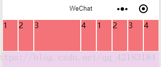
3.4 flex
flex: 1 1 50px;
3.5 order
<view class='container'>
  <view class='item' style='order:2'>1</view>
  <view class='item' style='order:3'>2</view>
  <view class='item' style='order:4'>3</view>
  <view class='item' style='order:1'>4</view>
</view>
3.6 align-self
.container{
  ...
  align-items: flex-start;
}

.item{
  ...
}

.item2{
  align-self: flex-end;
}

4.相对布局
精髓:相对定位的元素是相对自身进行定位的,参照物是自己
/* 为第二个元素设置了特殊样式 */
position: relative;
left:50rpx;
top:70rpx;
5.绝对布局
精髓:绝对定位的元素是相对离它自己的一个已定位的父级元素定位的
 /* 为第二个元素设置了特殊样式 */
 position:absolute;
 left:50rpx;
 top:70rpx;

<view class='container'>
  <view class='item'>1</view>
  <view class='item2'>2</view>
  <view class='item'>3</view>
  <view class='item'>4</view>
</view>

//!!!当父级元素也没有定位,就以整个页面为参照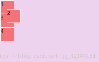
/*当父级元素已经定位了*/

.container{
  position: absolute;
  left: 80rpx;
  top:100rpx
}

/* 为第二个元素设置了特殊样式 */
.item2{
  position:absolute;
  left:50rpx;
  top:70rpx;
}
谢谢浏览,如有错误烦请指正, (≧∀≦)ゞ
边栏推荐
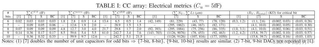
- Parasitic sensing size and detailed routing of binary weighted capacitors in charge graded DAC
- Regular expression learning notes
- Steps and common methods of data analysis
- Pytest testing framework built quickly
- Thread pool 02 -- source code
- Redis series 13 -- redis Sentinel
- 宏和枚举
- 多线程05--ReentrantLock 原理
- 具有任意电容比的共质心电容阵列的自动生成
- MySQL usage FAQs
猜你喜欢

Redis 系列11--Redis 持久化

selenium测试框架快速搭建(ui自动化测试)

Thread pool 01 -- basic use

Install pycharm
Constructive common centroid placement and routing of binary weighted capacitor arrays
Simulated student information input interface

【fpga】gtx/gth概述
二元加权电容器阵列的构造性共质心布局与布线

基于非线性最坏情况分析的电荷缩放 DAC 中电容器的新棋盘放置和尺寸调整方法

Using various weighting methods to place binary weighted capacitor array in SAR ADC
随机推荐
Modify the size of qtcreator interface
spark常见问题
文件
【keil软件】仿真时如何使用逻辑分析仪查看波形
Spark学习之SparkSQL
Deformable Detr paper accuracy, and analyze the network model structure
【面试:基础篇01:整数二分查找】
Redis series 15 -- redis cache cleaning
顺序表的创建插入和修改
application&富文本编辑器&文件上传
字符串split操作到底有多少坑
【FPGA】:ip核--DDR3
Commonly used operators of spark
Airtest 进行WebUI自动化测试(selenium)
Thread pool 01 -- basic use
测试开发
Rapid construction of the locust testing framework
具有任意电容比的共质心电容阵列的自动生成
MySQL connection failure solution
【FPGA】:aurora核的使用