当前位置:网站首页>An article takes you to understand CSS gradient knowledge
An article takes you to understand CSS gradient knowledge
2020-11-06 20:42:00 【Python advanced】
CSS3 Gradients allow you to smoothly transition your background color between two or more colors .
earlier , You have to use images to achieve these effects . However , By using CSS3 Gradients can reduce download time and bandwidth usage . Besides , Scaled elements look better when zooming , Because gradients are generated by browsers .
One 、 Browser support
The number in the table specifies the first browser version that fully supports this property .( From Baidu )
After the number -webkit- perhaps -moz- You need to specify the prefix when you use it .
| attribute | Chrome | Firefox | Safari | Opera | IE |
|---|---|---|---|---|---|
| linear-gradient | 26.0 10.0 -webkit- | 10.0 | 16.0 3.6 -moz- | 6.1 5.1 -webkit- | 12.1 11.1 -o- |
| radial-gradient | 26.0 10.0 -webkit- | 10.0 | 16.0 3.6 -moz- | 6.1 5.1 -webkit- | 12.1 11.6 -o- |
| repeating-linear-gradient | 26.0 10.0 -webkit- | 10.0 | 16.0 3.6 -moz- | 6.1 5.1 -webkit- | 12.1 11.1 -o- |
| repeating-radial-gradient | 26.0 10.0 -webkit- | 10.0 | 16.0 3.6 -moz- | 6.1 5.1 -webkit- | 12.1 11.6 -o- |
Two 、CSS3 Linear gradient ( Down / Up / towards the left / towards the right / tilt )
To create a linear gradient , Must define at least two color stops . Color stop is the color you want to render between smooth transitions . You can also set a starting point and a direction ( Or the angle ) And gradient effects .
grammar :
background: linear-gradient(direction, color-stop1, color-stop2, ...);
HTML Code :
<!DOCTYPE html>
<html lang="en">
<head>
  <meta charset="UTF-8">
  <title> project </title>

</head>
<body>

  <div id="grad1"></div>
</body>
</html>
for example :
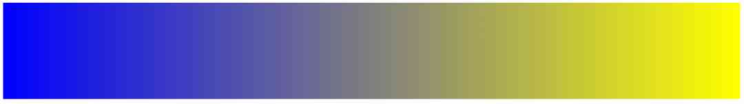
Linear gradient - Up and down
Show a linear gradient from the top . It starts in red , Transition to yellow :
<style>
    #grad1 {
        height: 200px;
        background: blue; /*  For browsers that don't support gradients  */
        background: -webkit-linear-gradient(blue, yellow); /* Safari 5.1  To  6.0 */
        background: -o-linear-gradient(blue, yellow); /* Opera 11.1  To  12.0 */
        background: -moz-linear-gradient(blue, yellow); /* Firefox 3.6  To  15 */
        background: linear-gradient(blue, yellow); /*  Standard grammar  ( Must be the last ) */
    }
</style>

Linear gradient - Left to right
for example :
Show a linear gradient from left . It starts in red , Transition to yellow
<style>
    #grad1 {
        height: 200px;
        background: blue; /*  For browsers that don't support gradients  */
        background: -webkit-linear-gradient(left, blue , yellow); /* Safari 5.1  To  6.0 */
        background: -o-linear-gradient(right, blue, yellow); /* Opera 11.1  To  12.0 */
        background: -moz-linear-gradient(right, blue, yellow); /* Firefox 3.6  To  15 */
        background: linear-gradient(to right, blue , yellow); /*  Standard grammar  ( Must be the last ) */
    }
</style>
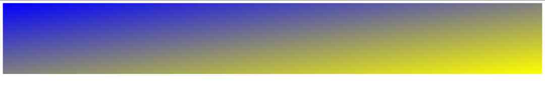
Linear gradient - Diagonals
Diagonal gradients can be achieved by specifying horizontal and vertical starting positions .
The following example shows a linear gradient starting from the upper left corner ( To the lower right corner ). It starts to be red , Transition to yellow :
<style>
    #grad1 {
        height: 200px;
        background: blue; /* For browsers that don't support gradients  */
        background: -webkit-linear-gradient(left top, blue, yellow); /* Safari 5.1  To  6.0 */
        background: -o-linear-gradient(bottom right, blue, yellow); /* Opera 11.1  To  12.0 */
        background: -moz-linear-gradient(bottom right, blue, yellow); /* Firefox 3.6  To  15 */
        background: linear-gradient(to bottom right, blue, yellow); /*  Standard grammar ( Must be the last ) */
    }
</style>
1. Use angle
If you want more control over the gradient direction , You can define an angle , Not the intended direction ( Next 、 On 、 Left 、 Wait right ).
grammar
background: linear-gradient(angle, color-stop1, color-stop2);
The following example shows how to use an angle on a linear gradient :
for example :
#grad {
  width: 100%;
  height: 100px;
  background: blue; /*  For browsers that don't support gradients  */
  background: -webkit-linear-gradient(-90deg, blue, yellow); /*  Safari 5.1  To  6.0 */
  background: -o-linear-gradient(-90deg, blue, yellow); /*  Opera 11.1  To  12.0 */
  background: -moz-linear-gradient(-90deg, blue, yellow); /*  Firefox 3.6  To  15 */
  background: linear-gradient(-90deg, blue, yellow); /*   Standard grammar  */
}

2. Use multiple stop colors
The following example shows a linear gradient with multiple stop colors ( From top to bottom )
for example :
#grad {
  background: blue; /*  For browsers that don't support gradients  */
  background: -webkit-linear-gradient(blue, yellow, green); /*  Safari 5.1  To  6.0 */
  background: -o-linear-gradient(blue, yellow, green); /*  Opera 11.1  To  12.0 */
  background: -moz-linear-gradient(blue, yellow, green); /*  Firefox 3.6  To  15 */
  background: linear-gradient(blue, yellow, green); /*  Standard grammar  */
}

The following example shows how to use rainbow colors and some text to create a linear gradient ( From left to right )
Gradient background
for example :
#grad {
  background: blue; /* For browsers that don't support gradients  */
  /*  Safari 5.1  To  6.0 */
  background: -webkit-linear-gradient(left,red,orange,yellow,green,blue,indigo,violet);
  /*  Opera 11.1  To  12.0 */
  background: -o-linear-gradient(left,red,orange,yellow,green,blue,indigo,violet);
  /*  Fx 3.6  To  15 */
  background: -moz-linear-gradient(left,red,orange,yellow,green,blue,indigo,violet);
  /* Standard syntax */
  background: linear-gradient( To  right, red,orange,yellow,green,blue,indigo,violet);
}

3. Transparency of use
CSS3 Gradients also support transparency , Can be used to create a fade in effect .
Add transparency , We use it rgba() Function to define the stop color . stay rgba() The last parameter of the function can be taken from 0 To 1 Value , And define the transparency of the color :0 Indicates full transparency ,1 The color is the complete representation of ( The opacity ).
The following example shows a linear gradient starting from the left . It's starting to be completely transparent , Transition to full red :
#grad {
  background: blue; /*   Browsers that don't support gradients  */
  background: -webkit-linear-gradient(left,rgba(255,0,0,0),rgba(255,0,0,1)); /*Safari 5.1-6*/
  background: -o-linear-gradient(right,rgba(255,0,0,0),rgba(255,0,0,1)); /*Opera 11.1-12*/
  background: -moz-linear-gradient(right,rgba(255,0,0,0),rgba(255,0,0,1)); /*Fx 3.6-15*/
  background: linear-gradient(to right, rgba(255,0,0,0), rgba(255,0,0,1)); /*Standard*/
}

4. Repeat linear gradient
repeating-linear-gradient() Function to repeat a linear gradient :
for example :
#grad {
  background: blue; /*   Browsers that don't support gradients  */
  /* Safari 5.1  To  6.0 */
  background: -webkit-repeating-linear-gradient(blue, yellow 10%, green 20%);
  /* Opera 11.1  To  12.0 */
  background: -o-repeating-linear-gradient(blue, yellow 10%, green 20%);
  /* Firefox 3.6  To  15 */
  background: -moz-repeating-linear-gradient(blue, yellow 10%, green 20%);
  /* Standard syntax */
  background: repeating-linear-gradient(blue, yellow 10%, green 20%);
}

3、 ... and 、CSS3 Radial Gradient ( Defined by the center )
The radial gradient is defined by its center .
To create a radial gradient , You must also define at least two stop colors .
grammar
background: radial-gradient(shape size at position, start-color, ..., last-color);
Radial Gradient - Evenly spaced stop color ( Default )
The following example shows a radial gradient , Its color is evenly spaced :
#grad {
  background: blue; /*  browsers that do not support gradients */
  background: -webkit-radial-gradient(blue, yellow, green); /* Safari 5.1  To  6.0 */
  background: -o-radial-gradient(blue, yellow, green); /*  Opera 11.6  To  12.0 */
  background: -moz-radial-gradient(blue, yellow, green); /*  Firefox 3.6  To  15 */
  background: radial-gradient(blue, yellow, green); /* Standard syntax */
}

Radial Gradient - Stop colors at different intervals
The following example shows a radial gradient with different spacing of color gradients :
#grad {
  background: blue; /* Browsers that don't support gradients  */
  background: -webkit-radial-gradient(blue 5%, yellow 15%, green 60%); /* Safari 5.1-6.0 */
  background: -o-radial-gradient(blue 5%, yellow 15%, green 60%); /*  Opera 11.6-12.0 */
  background: -moz-radial-gradient(blue 5%, yellow 15%, green 60%); /*  Firefox 3.6-15 */
  background: radial-gradient(blue 5%, yellow 15%, green 60%); /* Standard syntax */
}

1. Set shape
The shape parameter defines the shape . It can take a circle or an ellipse . The default value is ellipse .
The following example shows a circular radial gradient :
<!DOCTYPE html>
<html lang="en">
  <head>
    <meta charset="UTF-8">
    <title> project </title>
    <style>
      #grad1 {
        height: 150px;
        width: 200px;
        background: -webkit-radial-gradient(blue, yellow, green);
        /*  Safari 5.1  To  6.0 */
        background: -o-radial-gradient(blue, yellow, green);
        /*  Opera 11.6  To  12.0 */
        background: -moz-radial-gradient(blue, yellow, green);
        /*  Fx 3.6  To  15 */
        background: radial-gradient(blue, yellow, green);
        /*  Standard grammar ( Must be the last ) */
      }

      #grad2 {
        height: 150px;
        width: 200px;
        background: -webkit-radial-gradient(circle, blue, yellow, green);
        /*  Safari 5.1  To  6.0 */
        background: -o-radial-gradient(circle, blue, yellow, green);
        /*  Opera 11.6  To  12.0 */
        background: -moz-radial-gradient(circle, blue, yellow, green);
        /*  Fx 3.6  To  15 */
        background: radial-gradient(circle, blue, yellow, green);
        /*  Standard grammar ( Must be the last ) */
      }
</style>
  </head>
  <body>

    <h3> Radial Gradient - shape </h3>

    <p><strong> The ellipse ( This is the default ):</strong></p>
    <div id="grad1"></div>

    <p><strong> round :</strong></p>
    <div id="grad2"></div>

    <p><strong> Be careful :</strong> Internet Explorer 9  And earlier versions don't support gradients .</p>

  </body>
</html>

2. Repeat radial gradient
repeating-radial-gradient() Function is used to repeat radial gradients :
for example :
#grad {
  background: blue; /* Browsers that don't support gradients */
  /*  Safari 5.1  To  6.0 */
  background: -webkit-repeating-radial-gradient(blue, yellow 10%, green 15%);
  /*  Opera 11.6  To  12.0 */
  background: -o-repeating-radial-gradient(blue, yellow 10%, green 15%);
  /*  Firefox 3.6  To  15 */
  background: -moz-repeating-radial-gradient(blue, yellow 10%, green 15%);
  /* Standard syntax */
  background: repeating-radial-gradient(blue, yellow 10%, green 15%);
}

Four 、 summary
This article is based on html Basics , Through to css The gradient effect is explained in detail , Two common gradients are introduced . Through rich cases, we can better understand , To experience the use of gradients , Hope to help you learn better .
Want to learn more Python Web crawler and data mining knowledge , Go to a professional website :http://pdcfighting.com/ Want to learn more Python Web crawler and data mining knowledge , Go to a professional website :http://pdcfighting.com/
版权声明
本文为[Python advanced]所创,转载请带上原文链接,感谢
边栏推荐
- Will blockchain be the antidote to the global epidemic accelerating the transformation of Internet enterprises?
- Custom function form of pychar shortcut key
- Helping financial technology innovation and development, atfx is at the forefront of the industry
- 【自学unity2d传奇游戏开发】地图编辑器
- Try to build my mall from scratch (2): use JWT to protect our information security and perfect swagger configuration
- The AI method put forward by China has more and more influence. Tianda et al. Mined the development law of AI from a large number of literatures
- 意派Epub360丨你想要的H5模板都在这里,电子书、大转盘、红包雨、问卷调查……
- DRF JWT authentication module and self customization
- Contract trading system development | construction of smart contract trading platform
- 2020年第四届中国 BIM (数字建造)经理高峰论坛即将在杭举办
猜你喜欢

Individual annual work summary and 2019 work plan (Internet)

华为Mate 40 系列搭载HMS有什么亮点?
只有1个字节的文件实际占用多少磁盘空间
Gather in Beijing! The countdown to openi 2020
华为云微认证考试简介
文件过多时ls命令为什么会卡住?

It's easy to operate. ThreadLocal can also be used as a cache
理解格式化原理
意派Epub360丨你想要的H5模板都在这里,电子书、大转盘、红包雨、问卷调查……
The method of realizing high SLO on large scale kubernetes cluster
随机推荐
PHP application docking justswap special development kit【 JustSwap.PHP ]
Jetcache buried some of the operation, you can't accept it
DC-1靶機
Use modelarts quickly, zero base white can also play AI!
代码生成器插件与Creator预制体文件解析
es创建新的索引库并拷贝旧的索引库 实践亲测有效!
WeihanLi.Npoi 1.11.0/1.12.0 Release Notes
Introduction to X Window System
Ronglian completed US $125 million f round financing
Behind the record breaking Q2 revenue of Alibaba cloud, the cloud opening mode is reshaping
What is alicloud's experience of sweeping goods for 100 yuan?
解决 WPF 绑定集合后数据变动界面却不更新的问题
Multi robot market share solution
Basic usage of GDB debugging
Digital city responds to relevant national policies and vigorously develops the construction of digital twin platform
C# 调用SendMessage刷新任务栏图标(强制结束时图标未消失)
Installing ns-3 on ubuntu18.04
Bitcoin once exceeded 14000 US dollars and is about to face the test of the US election
What if the front end doesn't use spa? - Hacker News
Helping financial technology innovation and development, atfx is at the forefront of the industry